Blogs
October
Voila, the theme looks much better after some correction we made.
With so many of our customers and leads asking for some correction to the SuiteCRM's new theme SuiteP. We are so excited to share the fine tuned look of SuiteP.
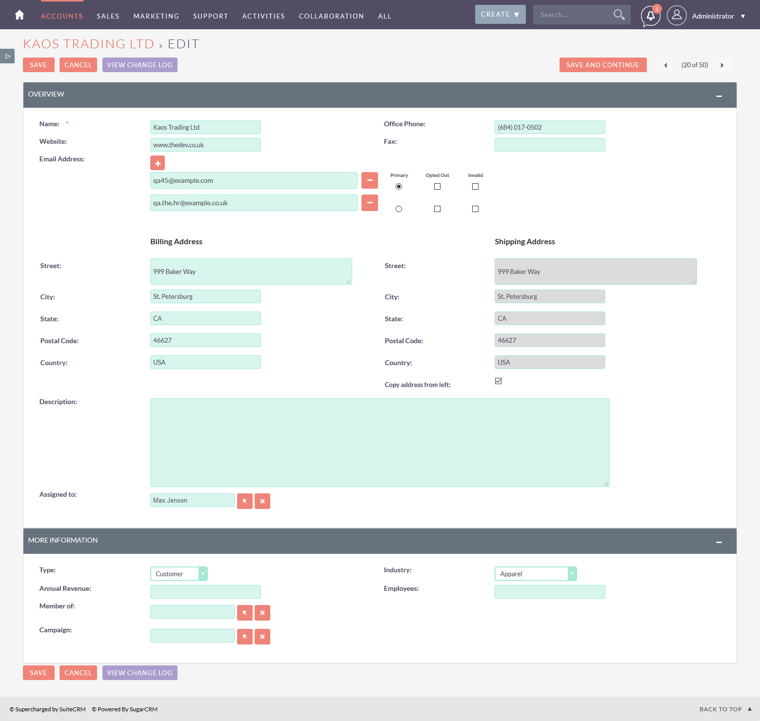
We got many request from our customers about the Large textbox, textareas and empty spaces which eats the major screen space on laptops and smaller devices.
We thought of giving them the satisfactory result to adapt the best product easily. Taking the latest version of SuiteCRM 7.7.7 we started to fine tune it in many major areas, and the results were the happy faces of customer checking the improved UI.
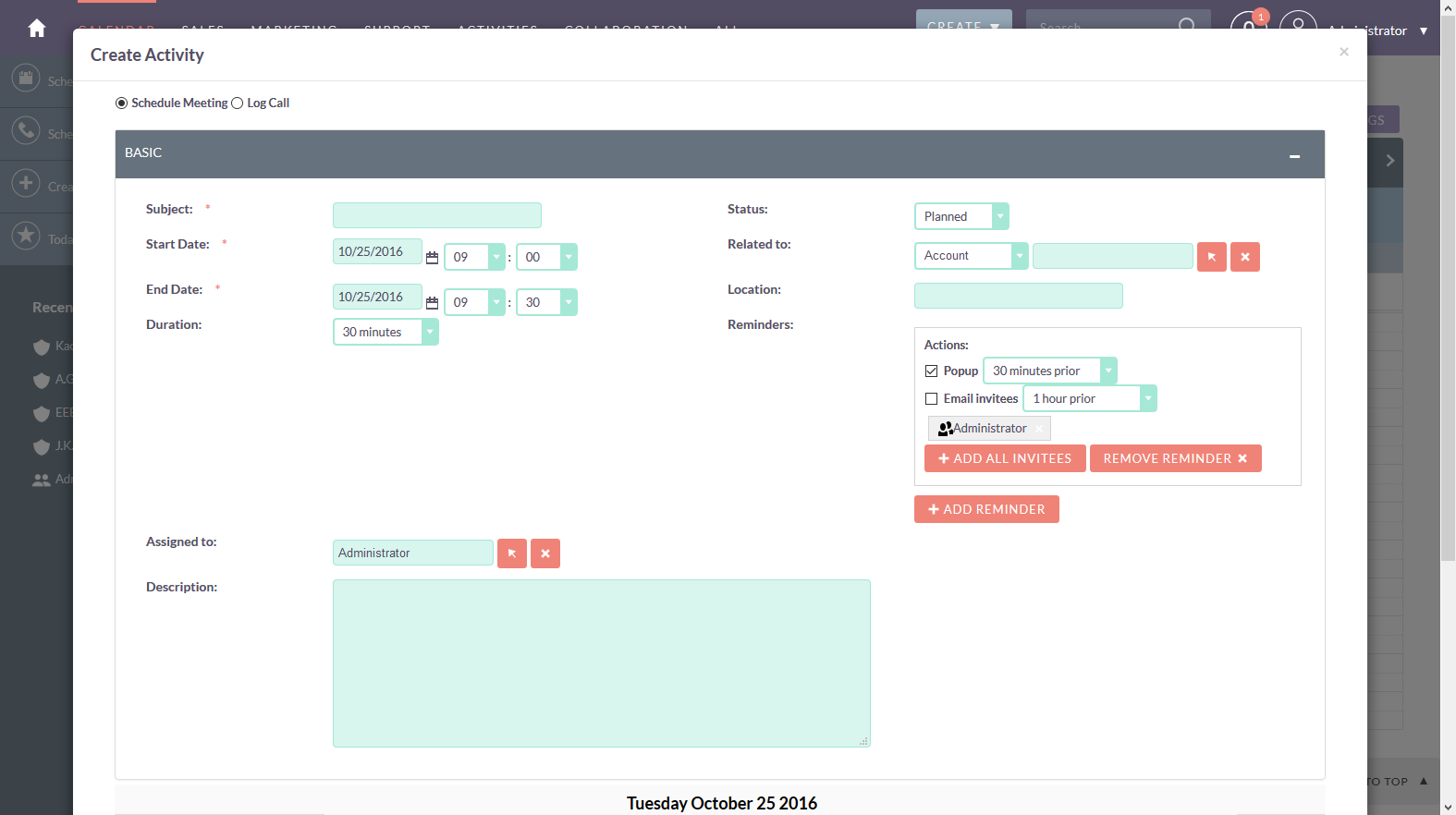
The major areas of changes were the Top menu, Empty space between the menu and the detailview, Large textbox, textareas, huge select boxes, Reduced button sizes. Improved the Calander quick create view so that the element can load up properly and have space between them, The popup has been increased in size.
We await for the community's response on the changes made. If sounds good we will share the changes in our next blog.
- Top Menu size, Search box, Empty Spaces below menu, SuiteCRM Dashboard tab height and the Action button size (BEFORE)

- Top Menu size, Search box, Empty Spaces below menu, SuiteCRM Dashboard tab height and the Action button size (AFTER)

- List View (Before)

- List View (After)

- Detail View (Before)

- Detail View (After)

- Edit View (Before)
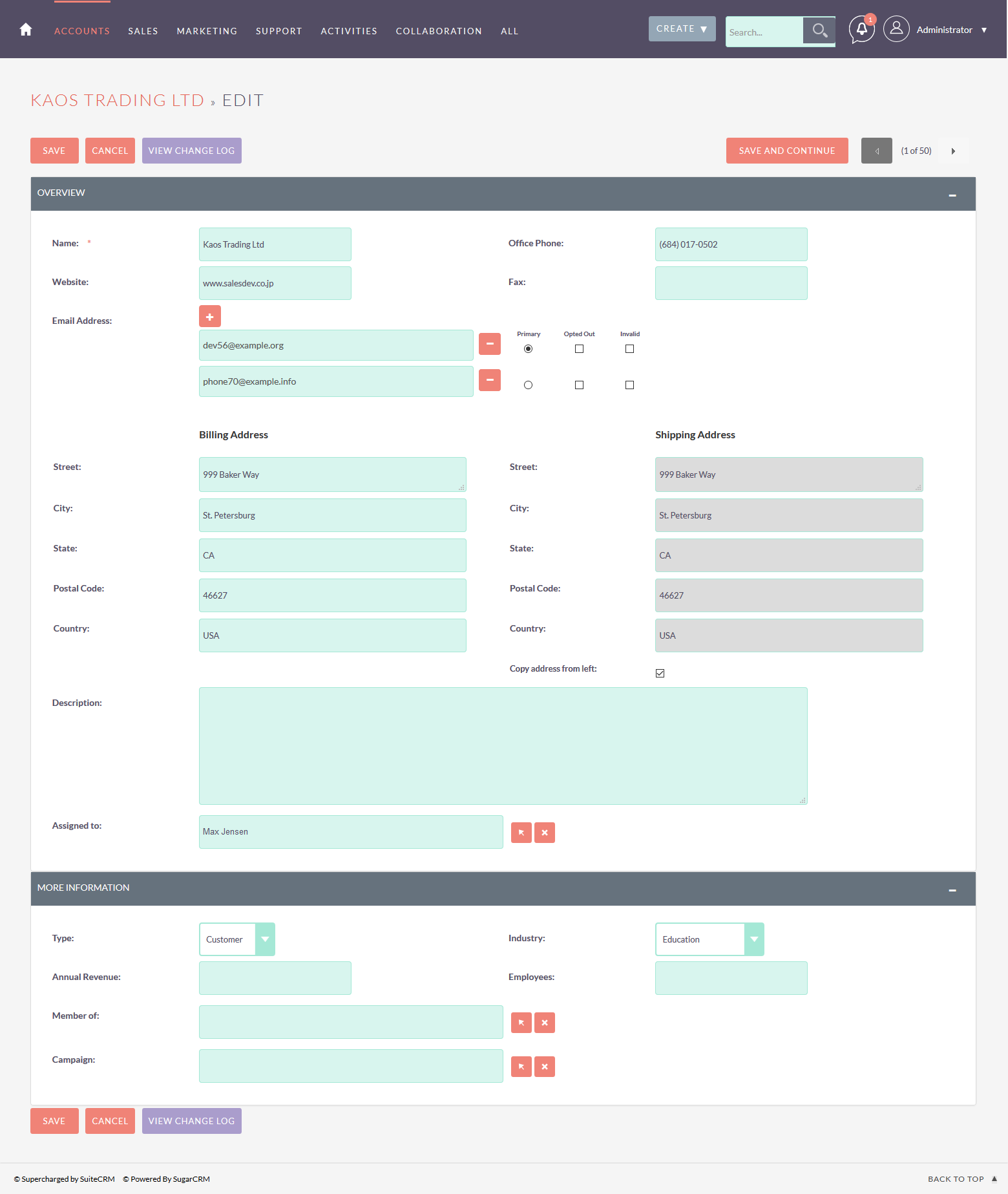
- Edit View (After)
- Calendar view (Before)
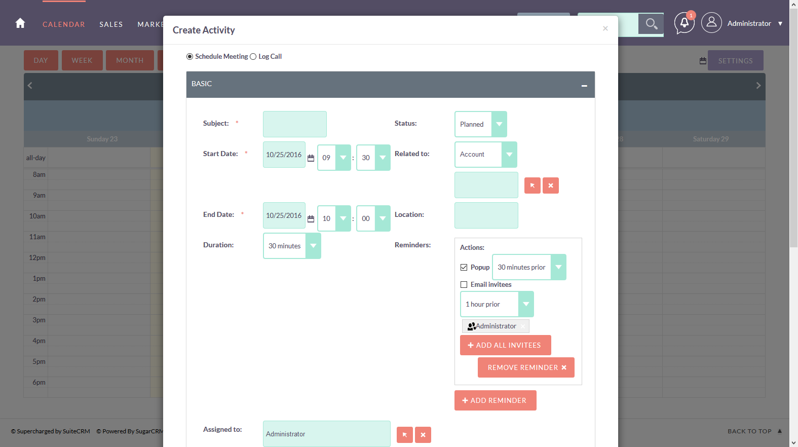
- Calendar view (After)
- Studio (Before)
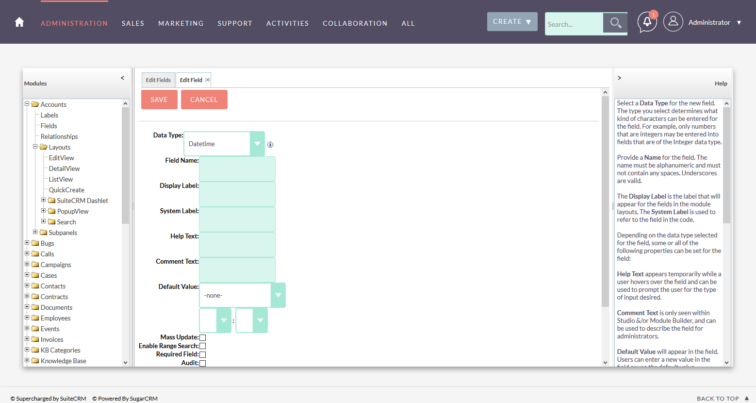
- Studio (After)
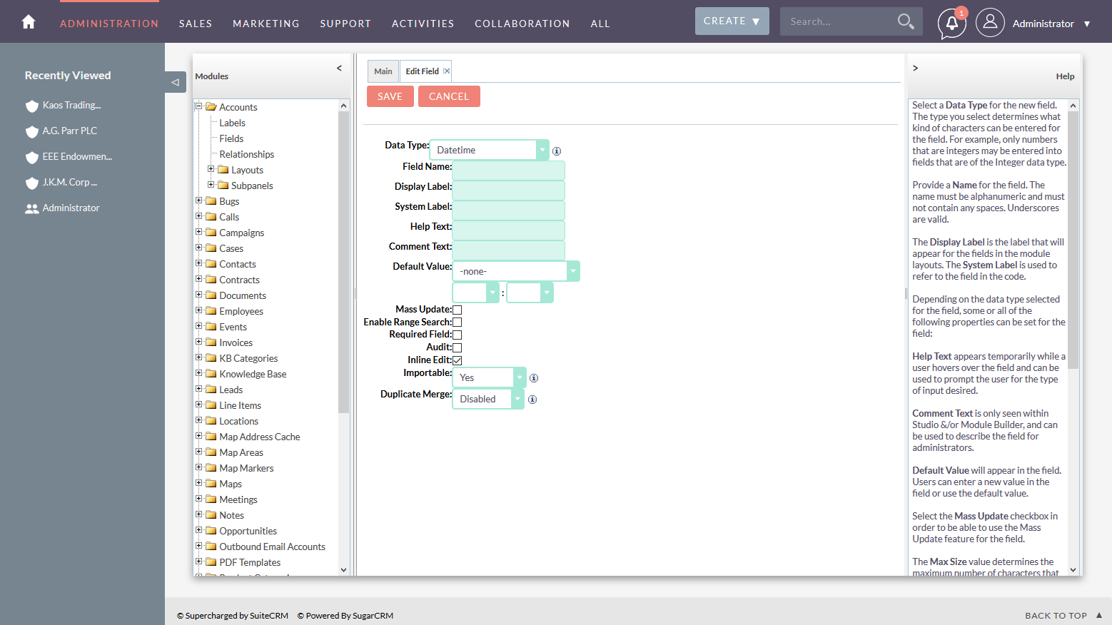
We have made many more improvements in the SuiteP theme in last couple of days, Many people have asked for the demo and immediately have asked for those improvements. Finally we are all set to share those changes, Refer our blog for more detail.
NOTE : We have made improvement to the theme as per our choice and on customer's demand. Their might be something which could have been left, but all in all the improved one looks nice and gives more space to breath.
Enjoy the improved view, Your likes and comments are appreciated.
NOTE: As SuiteCRM now incorporated most of the changes into the core SuiteCRM theme. So no further theme improvement is needed.
- SuiteP Improved theme package for Version 7.9.4 (4518 Download)
- SuiteP Improved Theme package for Version 7.7.7 (2783 Download)
- SuiteP Improved theme package for Version 7.7.8 (2831 Download)
- SuiteP Improved theme package for Version 7.8.3 (2289 Download)
- SuiteP Improved theme package for Version 7.8.4 (2202 Download)
- SuiteP Improved theme package for Version 7.9.0 (3269 Download)
- SuiteP Improved theme package for Version 7.9.8 (2775 Download)
Comments
-

 Posted by CARLOS| Thursday, 22 February 2018
Top panel turns black and covers 70% of the screen
I installed the theme in 7.9.14, but when I select to use it, the top panel turns black and covers 70% of the screen.
Is same problem as exposed by Jonathan in previous comments.
Many thanks! Posted by Aris| Friday, 09 February 2018
The theme make Suite CRM more professional by utilizing empty space, although I noticed some misbehavior on report Graphs. The graphs go outside their containers.
 Posted by Jonathan| Friday, 22 September 2017
I installed the theme in 7.9.4, but when I select to use it, the top panel turns black and covers 70% of the screen. I have attached a screenshot of the issue. Is this a known problem / is there any solution out there for it? The above screenshots look great - I would love to be able to utilize the updated theme! Thanks!
Before: https://i.imgur.com/TaoJ25R.png
After: https://i.imgur.com/8eXpmfM.jpg Posted by John Brand| Wednesday, 06 September 2017
BRILLIANT! 7.9.4 installed and this template has fixed every complaint I have had with it!
 Posted by Andreas Lotz| Saturday, 19 August 2017
Is it also possible to change the colors of this theme?
 Posted by Bogdan| Wednesday, 19 July 2017
How can you install the theme on a Windows Server based installation of SuiteCRM ?
 Posted by Ali Poonawala| Friday, 14 July 2017
Thanks for the improved Suite. It is excellent!!
I wanted to pass on a small tweak I made. In the new version, all Multi Select boxes were limited to a height of 30px which made it difficult to quickly scroll and select a value. So we made the following change
in /css/style.css
I changed line 4774 ( Look for "select[size] {" )
from:
height: 30px; /*edited by urdhva*/
to:
height: inherit; /*modification to urdhva*/
This will increase the height of multi select boxes, but it also makes the fields far more usable. Posted by Wolf| Thursday, 22 June 2017
It is great (and highly appreciated) that you took the time to share valuable insight on how to compact the SuiteCRM UI.
Now that SuiteCRM version 7.8.5 is out, can the UI package for version 7.8.4 still be used? Or would you please consider to release a theme version 7.8.5?
Post your comment

I'm using SuiteCRM 7.10
And unfortunately your template is not working with that version.
When will you build new version of your awesome theme?